Your Guide to the New Sender Dashboard
Last Updated:
The new dashboard provides a comprehensive view of all your marketing performance in one place.
At the top of your dashboard, you’ll find controls to customize your view:
Sales performance tracking requires integration with Shopify, WooCommerce, PrestaShop, or another supported e-commerce platform. If you haven’t connected your store yet, click here to learn how.
The sales performance section displays four critical metrics at the top:
The main chart displays your revenue trends over time with two visualization options:
The chart uses color-coding to distinguish between campaign sales and automation sales, making it easy to see which type of messaging drives more revenue.
Hover your mouse over any specific day on the chart to see:
This daily breakdown helps you identify which days perform best and understand the contribution of each channel.
Below the main metrics, you’ll find a detailed breakdown showing exactly where your revenue is coming from:
This breakdown helps you identify which channel is performing best and where to focus your efforts.
Enable comparison mode to analyze how your current performance stacks up against previous periods. For example, compare the last 30 days with the previous 30 days to identify growth trends or areas needing improvement.
This section highlights your top-performing email campaigns during the selected timeframe.
NOTE: If you have an e-commerce store connected, campaigns are ranked by sales generated. If you haven’t integrated an e-commerce platform, campaigns are ranked by clicks.
Each campaign entry displays:
Click “See all emails” in the top right corner to view your complete campaign list and dive deeper into individual campaign performance.
Use this insight to identify what content resonates most with your audience and replicate successful strategies.
This report applies to email campaigns only.
The traffic and reach section shows engagement metrics for all emails sent during your selected period. Track how many people are clicking through your campaigns and opening your messages.
At the top of this section, you’ll see four primary metrics:
The main chart displays three trend lines over time showing total emails sent, total opens, and total clicks. This visualization helps you understand engagement patterns and identify peaks in your email activity.
Hover over any day/week/month (depending on your selected period length) on the chart to see detailed insights showing opens generated by campaigns versus opens generated by automation emails.
This helps you understand whether your scheduled campaigns or automated workflows are driving more engagement.
Just like the sales performance section, you can compare your current traffic stats with previous time periods to measure improvement.
Below the chart, you’ll find important email health metrics that help you monitor the health of your email list and identify potential deliverability issues:
Monitor how your email list is growing over time with detailed daily insights.
At the top of this section, you’ll see three summary metrics with percentage changes compared to your selected comparison period:
Use the “Show data for” dropdown to filter your subscriber growth by:
When you select a filter option, a search field appears where you can type to find specific groups or segments from your list. This filtering capability helps you understand which segments are growing fastest and where your best subscribers are coming from.
The stacked bar chart displays your net subscriber growth over time. Each bar uses color-coding to show new subscribers, existing subscribers, and losses from unsubscribes and bounces. This visualization makes it easy to spot trends and see the overall health of your list.
Hover your mouse over any specific day to see a detailed breakdown:
This daily breakdown helps you identify your most effective acquisition channels and spot potential issues with list quality.
Get personalized suggestions to maximize your email marketing performance under the “Recommended for you” heading. Sender analyzes your account activity and provides actionable recommendations tailored to your needs.
Each recommendation card includes:
Plan your campaigns for any occasion with the integrated marketing calendar. This component shows upcoming holidays, seasonal events, and your scheduled campaigns all in one place.
The calendar displays:
When you hover over a date with multiple campaigns, you’ll see a preview showing individual campaign names and types (email or SMS). If there are more campaigns than can be displayed, you’ll see a “+1 more” or “+2 more” indicator.
Use the calendar to:
The calendar helps you stay organized and never miss important marketing opportunities throughout the year.
Access educational resources directly from your dashboard. This section includes two quick-access buttons at the top:
Below the quick-access buttons, you’ll find a scrollable carousel of video tutorials. Use the left and right arrow buttons to browse through available content.
Learn as you go and implement new strategies without leaving your dashboard. These step-by-step video tutorials make it easy to master Sender’s features at your own pace.
If you got stuck on a specific task or can’t find a way to execute a particular job, contact our support team via LiveChat or [email protected] – we’re here to help 24/7.
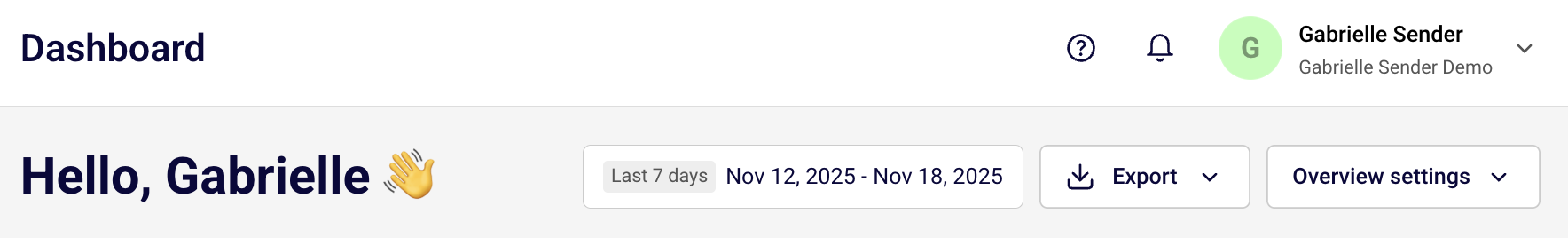
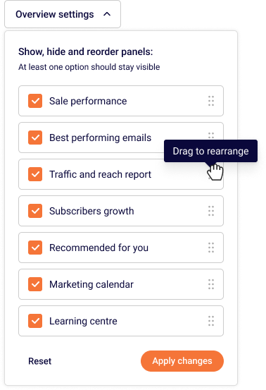
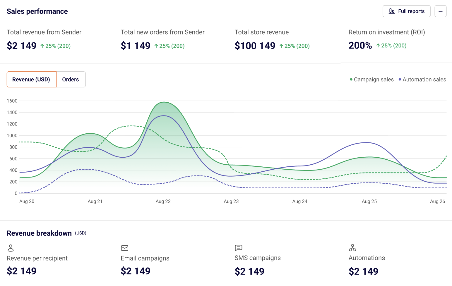
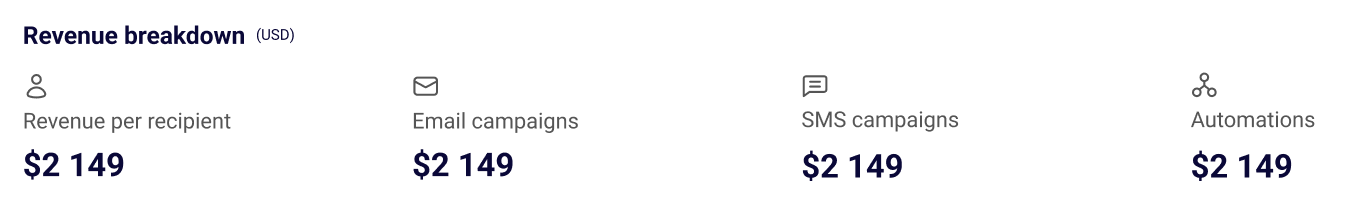
All the features your business needs to
acquire high-quality leads, grow sales, and maximize revenue from campaigns
using one simple dashboard.